Someone clicks your page for one quick answer. But the document is cramped, links say “Read more,” and the embed feels like a tiny app inside your post. So they leave. That is content friction. The good news? A few simple content accessibility guidelines can fix a lot of it in WordPress.

And it is not just about convenience. These guidelines also help people with disabilities, like visitors who use screen readers, rely on keyboards instead of a mouse or need a clearer structure to read and navigate. When you embed PDFs, docs and other content the right way, EmbedPress helps you keep everything clean, responsive and easy to use without code.
The Friction Problem inside WordPress Content
WordPress gives you freedom. That is the good part. The tricky part is that every page becomes a collection of choices – theme styles, blocks, embeds, menus and tiny UI controls that either support users or silently block them. The WordPress Theme Handbook puts the goal plainly: pages should be usable for everyone, including people who cannot see or use a mouse. Plus, WordPress’s own accessibility guidance is clear that users must be able to operate a site with a keyboard or other assistive tools.
In other words: make your pages easy to scan, easy to click and easy to move through without a mouse. That is what most visitors want anyway. Here are a few common frictions that show up on WordPress sites:
- A menu opens on hover, but will not open with a keyboard (or will not close once opened).
- Headings are used for styling, not structure. So, the page becomes hard to scan, especially for screen readers.
- A document embed is too small on mobile, so users pinch-zoom for every paragraph.
- Link text says “click here” or “read more” with no context, so a list of links becomes meaningless.
These are not “nice to fix later” issues. They sit right at the heart of WordPress accessibility guidelines and keyboard navigation accessibility. The sooner you fix them, the better the entire experience becomes calmer, the site becomes clearer and faster to use.
What Content Accessibility Guidelines Mean
When people say content accessibility guidelines, they usually mean a set of rules and habits that help more people read, watch and interact with web content – no matter what device they use or how they navigate.
The most referenced standard behind these guidelines is the WCAG accessibility guidelines. WCAG organizes accessibility into four principles: Perceivable, Operable, Understandable and Robust. And then breaks those into testable success criteria (Levels A, AA, AAA).
In plain words, people should be able to see your content, use it (even with a keyboard), understand it and trust it. If any step feels hard, friction goes up fast.
If you want a modern target, WCAG 2.2 is the current version recommended by the World Wide Web Consortium (W3C) for future applicability. And, it adds new success criteria around things people often struggle with in real life: focus visibility, drag-only interactions, touch target size, consistent help and accessible authentication.
Do not worry about memorizing version numbers. Use WCAG as a checklist and keep improving one page at a time. Progress beats perfection.
Here is the part WordPress creators sometimes miss: accessibility is not just developer territory. The WCAG accessibility guidelines were written to be used by many roles – designers, developers, content authors, etc. Because content structure and clarity are part of the standard, too. That is why “web content accessibility best practices” are so powerful. They make accessibility practical.
Content Accessibility Guidelines You Can Apply in WordPress Today

This section is your “do this, not that” core. It is not meant to replace WCAG checklists. It is meant to help you publish better pages this week and keep doing it next week, too.
Think of these as content accessibility guidelines that also reduce friction for everyone, including the people who will never call themselves “specially abled,” but still browse on a cracked phone screen.
Use Headings Like a Map, Not Like Decoration
Headings are not just bigger text; they are structured. WordPress notes that headings help break content into logical sections and that screen reader users can scan a page by headings and jump to sections via those headings.
So make your headings do real work:
- Keep them in order (H2 under H1, then H3 under H2).
- Use them to describe the section (like, “How refunds work”)
This is one of the simplest ways to create screen reader-friendly content without changing your tone at all.
Add Links That Still Make Sense Out of Context
WordPress points out that some assistive software presents links as a list, out of context, so link text should describe the destination or action. It also discourages bare URLs as link text.
Try this small rule: if a link is read alone, would it still make sense?
- “Download the pricing guide (PDF).”
- “See the onboarding checklist.”
- “Watch the 2‑minute setup video.”
That is WordPress accessibility guidance and web content accessibility best practices working together. And do not forget images. WordPress guidance reminds theme authors that non-decorative images should have meaningful alt text.
Even as a content writer, you control a lot of this through the Media Library and the way you use images in posts. So, your pages become more screen reader-friendly content instead of a guessing game.
Make Keyboard Movement Smooth And Predictable
Keyboard navigation accessibility is not a “developer-only” concern. If your content adds popups, embedded widgets or interactive blocks, you can create places where the keyboard gets stuck without realizing it.
Both the WordPress Theme Handbook and Automattic’s WordPress accessibility overview highlight the importance of keyboard-usable controls and suggest testing by navigating the site using only a keyboard. checking focus visibility and logical order.
A quick, content-team-friendly standard:
- You can tab to every important element.
- Focus is visible (an outline or highlight).
- You can always escape menus, modals and embedded content.
Keep Text And UI Readable
Readability is accessibility. WordPress accessibility guidance references WCAG AA-level contrast expectations for text (including the familiar 4.5:1 contrast ratio for plain text) and expects content to remain usable when text is resized up to 200%.
Even if you are “just writing,” your choices matter:
- Avoid low-contrast text that looks stylish but strains the eyes.
- Do not hide important info in tiny footnotes.
- Break long paragraphs so people can breathe between ideas.
These are web content accessibility best practices that also improve comprehension and reduce bounce-worthy frustration.
Label Forms Clearly, Do Not Rely on Placeholders
WordPress theme guidance is direct: input fields must have a label and placeholders are not a replacement. It also emphasizes visible focus styles and the logical order in which you move through items in forms.
If your page has a signup form next to an embed, this matters twice. A visitor should be able to view the content, get the offer and complete the form using only a keyboard if needed, without guessing what each field means.
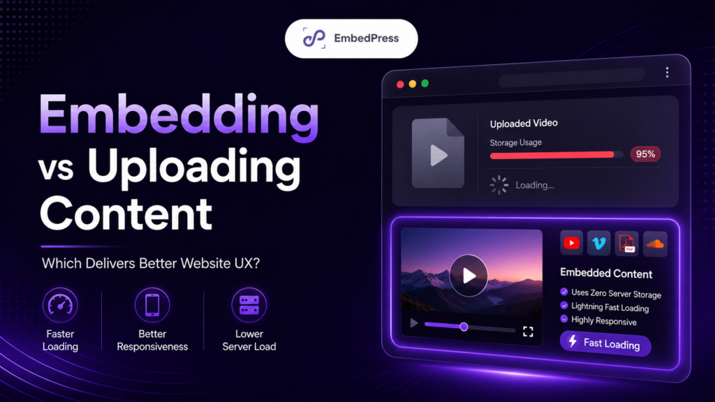
The Embed Zone: Making Documents And PDFs Easier to Access

Embeds are amazing, but they also break easily. One embed can turn a smooth page into a maze, especially when it comes to documents.
That is why your embed strategy must include content accessibility guidelines. If your team writes strong pages but ignores embeds, you end up following content accessibility guidelines “on paper” while the real experience stays frustrating. If people cannot comfortably consume embedded content, the rest of your work does not matter.
Start with a Simple Truth about PDFs
If you want accessible PDF embeds in WordPress, you need two things: an accessible PDF and an easy viewing experience. Embedding cannot “repair” a broken file. But it can make a good file feel effortless to read. For a step-by-step setup, see how to embed documents and PDFs.
One practical example comes from Western Michigan University’s digital accessibility guidance: it recommends basics like tagging and structure. verifying reading order, adding alt text for meaningful figures, setting document title/language and avoiding security settings that block assistive technologies.
So before you embed anything, ask: “Is this PDF actually readable by assistive tools (like screen readers)?” That is how you protect screen reader-friendly content – even when the content is a file, not a page.
Make the Embed Feel Like Part of the Page
Even with a good PDF, embed friction can sneak in:
- The frame is too small, so people cannot read without zoom.
- Controls are inconsistent across pages, so users keep relearning.
- On mobile, the embed feels like an awkward mini-app inside your post.
Your goal is to make document viewing calm. This is where “web content accessibility best practices” become very practical: add a descriptive heading above the embed. Give a one-sentence summary, and provide a clear alternate link (open in a new tab or download).
Done well, this reduces friction and supports keyboard navigation, because users can choose the path that works best for them.
How EmbedPress Supports a Lower-Friction, More Accessible Experience

You can follow the WordPress accessibility guidelines and still lose readers if your embeds feel messy. That is because embeds are where attention slips away. If you want a fast, practical way to reduce friction, EmbedPress gives you a consistent, responsive embed experience across pages.
It is an all-in-one embedding plugin. It helps you embed content from many sources without coding. That includes 250+ sources, including documents (PDF/DOC/PPT/XLS), videos, social content and more, shown in a layout that works on mobile and desktop.
Want to explore what it can embed? See EmbedPress Features, or check the plugin listing on WordPress.org.
Using EmbedPress for Document Embeds
For documents, the EmbedPress shows a simple flow: add the EmbedPress PDF block, pick your file from the Media Library, then adjust a few display options and publish. The same idea works in Elementor with the PDF widget – drag, drop, upload, done.
This matters because accessible PDF embeds in WordPress are not only about the file. They are also about consistent delivery, so the viewing experience is predictable across posts, pages and devices. A consistent embed flow reduces user effort, which is a big part of friction reduction.
Embedding without “Accessibility Theater”
It might be easy to add an embed and assume the job is done. But WCAG accessibility guidelines focus on outcomes – can people see, use and get the content – not on whether you used a fancy tool.
So use EmbedPress as a support system, not a shortcut:
- Create or fix the source PDF so it is accessible.
- Embed it responsively so it is readable.
- Add context so it is understandable.
- Test it with keyboard navigation accessibility before publishing.
That is how content accessibility guidelines become real experience instead of a checkbox.
A Publish-Day Checklist for Accessible Content in WordPress
This is the part you can copy into your team’s standard operating procedure. It is short on purpose. You will actually use it. And yes, every item below doubles as “less friction.” Not later, immediately.
Before you hit publish:
- Structure: Headings are in order and describe what each section is. (Helps scanning and screen readers.)
- Links: Link text is descriptive and makes sense out of context.
- Documents: If you are embedding a PDF, it is tagged/structured, has logical reading order, and is not a scan-only file without OCR.
- Embeds: Your accessible PDF embeds in WordPress are readable on mobile and paired with a clear open/download option.
- Keyboard: Do a 2-minute keyboard navigation accessibility pass – tab through, confirm focus visibility and make sure you can enter and exit embeds or menus.
If you run this checklist consistently, you will deliver more screen reader friendly content, follow WordPress accessibility guidelines more naturally, and build pages that feel effortless to use. That is the point.
The best part? These improvements do not just help “someone else.” They help your actual audience today – people on mobile, people in a hurry, people multitasking, people with temporary injuries and people using assistive tools (like screen readers). Accessibility is usability, scaled.
Make Your Embeds More Accessible with Best Practices
You do not need perfect accessibility overnight. You need momentum. Start with a few high-impact content accessibility guidelines – structure, descriptive links, readable embeds and keyboard checks. Then, build from there.
When you pair those habits with a cleaner embedding workflow (like the document blocks and URL-based embedding described in EmbedPress documentation and plugin listings). you reduce friction where it hurts most: at the moment someone tries to consume your content. And that is how content accessibility guidelines become a real advantage in WordPress, not just a nice idea.
If you have found this blog helpful, share your opinion in the comment section and get connected to our Facebook community. You can also subscribe to our blogs for valuable tutorials, guides, knowledge, tips and the latest WordPress updates.