Are you aware that over 55% of global web traffic now comes from mobile devices? Over the years, mobile devices have become indispensable and reshaped the way you communicate, shop, and search for information. This is why optimizing websites for mobile is not just important—it is essential. However, when it comes to optimize content heavy websites, it is not just about optimizing responsiveness; rather, it is about understanding user behavior, needs and preferences.

In the comprehensive blog, we will let you know how you can optimize your content-rich websites for mobile & why you need to do so. Let us get started.
Understanding Content Heavy Website & Its Examples
Prior to knowing how to optimize content-heavy websites for mobile, you need to know what the phrase ‘content-heavy’ actually means. A content heavy website refers to holding an extensive amount of content or information. Here are some examples:
- News outlets & digital publishers
- Educational institutes—universities, colleges, schools, and more
- eCommerce platforms with huge amounts of inventory
- Agencies with huge portfolios
For the above entities, content is a must to attract visitors and deliver all the information. To meet the objectives of audiences and distribute the information; these websites need to put more content than others on their websites.
Is Mobile Optimization Easy For Content Heavy Websites?
No doubt that optimizing content heavy websites is not an easy task at all. The complexity lies in two key factors: content volume and revenue model.
1. Content Volume: It refers to the adaptation of the small screen of a vast amount of content without losing the readability and usability of the users.
2. Revenue Model: Speaking of generating income, different content heavy websites hold different models that bring another layout of complexity to mobile optimization. Such as:
👉 eCommerce Sites: According to Amazon’s business model, they are relying greatly on user-generated content, product listing, and reviews to drive sales.
👉 Corporate Sites: Coca-Cola, for example, instead of making a profit from websites, the revenue comes directly from their products.
From the discussion, it is evident that businesses have different models based on revenue and displaying content. That is why, optimizing the websites for mobile may sometimes seem difficult. With that said, everything has a possible solution—let us get into that.
Why Do You Need To Optimize Website For Mobile?
At this moment, mobile is king based on its user base. According to TechJury reports, globally 4 billion mobile users are available and in the US particularly, 53% of page views come from mobile devices. Given this huge statistics priority, mobile optimization for websites is mandatory.
Mobile optimization, however, is not only confined to the idea of making it responsive nowadays. Rather, providing the best user experience that focuses on users finding what they need, relevant and enjoyable content to interact with, eventually; making the user journey remember-worthy.
In an effective UX design, Peter Morville mentioned 7 important elements that make the user experience the best. It is called honeycomb outlines that bring a new and fresh perspective for content heavy websites. A new approach to redesign and optimization for designers to innovate and refine the work.

However, a distinct design strategy is needed to deliver a shameless mobile experience. Here are the elements to take account of:
- Content Adaptation: Make sure website content is well-optimized for smaller screens. While viewing vertically, ensure the content is easy to read and interactive enough.
- Intuitive Navigation: Need to imply a user-friendly navigation system so that users can use it without facing any hassle.
- Consistency Across Devices: Provide a unified brand look and experience across all devices by maintaining consistency.
5 Things You Need To Do For Optimizing Content Heavy Website
A strategic approach is required to optimize content heavy websites that ensure fast loading times, easy navigation, and ultimately, great user experience. When you have packed your site with blogs, images, and steps more; you definitely need to keep an eye on usability. To do so, the following are what you need to take care of.
Research & Know The Users’ Needs, Habits, Goals
One thing you need to remember is that users come first keeping users’ needs, habits and goals in mind for mobile users. Once you successfully know your audience, you can make them stick with you for a longer period. Knowing your users helps you identify which sections you need to improve.
In order to meet the users’ expectations, a native mobile experience is crucial. This ensures that your website adapts to different devices without making any compromise with the user experience.
Mainly, you can go with two different approaches: responsive and adaptive design. The methodologies of these two are different but serve one common purpose—the best user experience. Adjusting the layout depending on screen size, is called responsive design. While adaptive design refers to complete changes based on the device.
However, both the loading speed and appearance of the elements of your website have an impact on how you design your content heavy website. Neither you can solely focus on speed, nor the appearance of the elements of your website. All you need to understand is where you have to adapt which method—going with adaptive or responsive design.
Make Navigation As User-Friendly As It Could Be
Especially for mobile, your website navigation has to be user-friendly by any means. Otherwise, visitors will leave your site if they face any struggle to find their way around. Needless to say, in comparison with desktops, mobile sites need a more intuitive navigation system.
Moreover, you need to make sure the touchscreen targets should be big enough so that users can tap it easily and accurately. Plus, do a study on how people usually hold their mobile phones to imply the ‘thumb zone’ correctly placing important buttons and CTAs within easy search of users.
Last, but not least, try to reduce clutter and minimize (as much as you can) navigation options. Keep necessary elements to avoid slowing down your website and ensure easy movement between multiple pages.
Here are a few important tips to provide a better mobile experience:
- Balance the contrast between design elements
- Use typography and font size that users notice clearly
- Apply smooth animations and transitions to make user action confirmed
Keep Your Website Speedy Enough
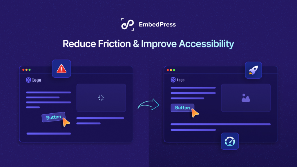
For content heave and mobile-optimized websites, fast loading times are essential. These are the sites that rely on organic search traffic. Once users click, they prefer fast loading times, or else; they leave right away without giving it a second thought.
Regardless of the network, however, as a website owner, you have to make sure that your site loads quickly and serves users in the best possible way. It is a fact that you can not load everything at once. This is why, prioritize key elements first, and keep the rest in the queue.
Always remember—balance always is a key! Load elements that are needed now and preload what is next to keep the right balance of your website speed.
Place Your Ads Carefully
In user experience, placing ads plays a crucial role if you have any on your website. Ads that are disruptive make users leave your site instantly. So you need to focus on making and placing ads at the right time in the right place to keep your audience engaged and make them glued to your website.
Best practices for ad placement:
- Try not to place banners at the top of the page as users often scroll down instantly
- Make sure there is no space between content and ads for accidental clicks
- Avoid positioning ads within links, lists or blockquotes
- Keep ad density under 30% of your content
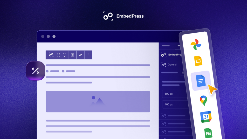
Use Content From Other Sources Without Coding
You often need to use content from other sources on your website. With that said, using heavy elements from different sources might make your site heavier than you can think of. In that case, you can go with embedding content easily on your site.
By any chance, however, if you have a site that is built with WordPress, embedding content from other sources is seamless. All you have to do is simply copy and paste.
Many plugins are available to do this task for you, In fact, WordPress itself offers an embedding option to use content from other sources on your site. But to get the most flexibility, customization options and sources to embed from—EmbedPress could be the solution.

EmbedPress—the all-in-all embedding solution that offers the ability to embed multimedia content from 150+ sources (including YouTube, Vimeo, Twitter, Instagram, and many more) into WordPress websites. With the continuation of growth, EmbedPress is now loved by 100K+ websites and improving its narrative efficiency.
Prioritize Users First & Optimize Your Website Accordingly
To make visitors stick to your content heavy website, you need to optimize everything for mobile by taking into consideration of its users. This could be challenging at some point but doable when you think about everything from the user’s perspective. Needless to say, start prioritizing users from the design phase—it should be simple, intuitive and practical.
If you have found this blog helpful, share your opinion in the comment section and get connected to our Facebook community. You can also subscribe to our blogs for valuable tutorials, guides, knowledge, tips, and the latest updates for optimizing your website.

